Art History
DECEMBER 2016
The influencing artist for my artwork was Banksy. Banksy is a graffiti artist in London but his identity is unknown. All of his work is spraypaint but looks real. Both of our works of art are similar because the items in our work are unexpected. the difference is that Banksy's art is trying to inspire people. I think that he would be proud if my artwork but only because of the effort.
The influencing artist for my artwork was Banksy. Banksy is a graffiti artist in London but his identity is unknown. All of his work is spraypaint but looks real. Both of our works of art are similar because the items in our work are unexpected. the difference is that Banksy's art is trying to inspire people. I think that he would be proud if my artwork but only because of the effort.
ONE-POINT PERSPECTIVE

Aesthetic Response |
Just as people try to do in life, within this drawing I have drawn things that either I love or represent me. I spend most of my life at school, so that is the setting. School is not necessarily the most fun thing in life, so the drawing is in black and white. In my free time, I love to listen to music. Listening to music takes me to a different place and changes my views of the world. When I listen to music, I feel like no one can bother me. This is why the music line is floating and why “Green Day” is on a cloud. Green Day is my favorite band of all time. I also love to watch YouTube so the logo is on the TV. Mary, Joseph, and baby Jesus are in the hallway because Jesus is a big part of my life. My three favorite movie series are Star Wars, The Hunger Games, and Harry Potter. These three movies are drawn on posters in the hallway. Most of the things that I have mentioned are a form of art: Music, movies, videos. So in the end, the thing that takes up the biggest part of my life is art.
|
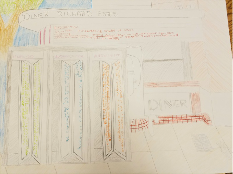
Art Criticism
NOVEMBER/DECEMBER 2016
Production
MASHUP PROJECT
March-April 2017
For my mashup project, I combined art, technology, and music. I painted the album cover to the Gorillaz's 'Demon Days'. In the bottom left hand corner there is a QR code. Upon scanning this, you will be taken to this album on YouTube.
March-April 2017
For my mashup project, I combined art, technology, and music. I painted the album cover to the Gorillaz's 'Demon Days'. In the bottom left hand corner there is a QR code. Upon scanning this, you will be taken to this album on YouTube.

Demon Days Statement
I have been a fan of the Gorillaz for a long time now and I am glad that they have started coming out with more music recently. The Demon Days album has been my favorite because that is the one that everyone knows them by, and I really like the design of the cover. My favorite things to draw are album covers because there are so many and music takes up a big part of my life. I chose to draw this cover not only for that reason but also because I can relate to each of the characters. Like me, Murdoc(top left) tends to act a little weird and crazy. Noodle(bottom left) does things without caring about what other people think. 2D(top right) is humble and doesn't want to be the center of attention. Lastly, Russel(bottom right) is the drummer and I would like to learn how to play the drums.
In my project, I brought together all of the principles of art. Proportion is shown because all of the boxes and faces are evenly spaced and sized. This album cover has a symmetrical balance. Rhythm is shown considering that the four faces/boxes create a pattern and movement. The colors are a little bit different from the actual album cover, however, the real album cover shows variety because each color almost has their own analogous. The colors are different than the original due to a limit of resources. Most of the colors are a blend of two other colors. Doing this adds some originality to it. There is not a lot of emphasis in this art, but I would say that the emphasis would be on 2D(top right) because he is the face that people see first. The QR code shows unity because it shows the viewer that the art is done and they can listen to the album.
In my project, I brought together all of the principles of art. Proportion is shown because all of the boxes and faces are evenly spaced and sized. This album cover has a symmetrical balance. Rhythm is shown considering that the four faces/boxes create a pattern and movement. The colors are a little bit different from the actual album cover, however, the real album cover shows variety because each color almost has their own analogous. The colors are different than the original due to a limit of resources. Most of the colors are a blend of two other colors. Doing this adds some originality to it. There is not a lot of emphasis in this art, but I would say that the emphasis would be on 2D(top right) because he is the face that people see first. The QR code shows unity because it shows the viewer that the art is done and they can listen to the album.
